The Mood Science: Color, Light, and Perception
Color and light shape emotion before anyone registers material. White stone amplifies daylight, making small rooms feel larger and calmer. Cool light sharpens edges; warm light adds comfort. Black stone compresses visual volume in a deliberate way, framing objects and art and creating intimacy after sunset. When the same slab is viewed under different Kelvin settings, it reads as different design; that is why lighting mockups are not a luxury but a requirement.
Reflectance and contrast also influence how tidy a room appears. Polished dark planes can reveal fingerprints and mineral spots faster in splash areas, while matte whites mute micro-marks. None of this is a flaw in the stone; it simply means finish and lighting must be chosen together.

Performance Benchmarks Clients Can Trust
Professional specifications should cite recognized stone standards and test data. Ask suppliers for density, water absorption, flexural and compressive strength, and abrasion resistance from accredited testing. Equally important is a care plan that names neutral-pH cleaners, sealing cadence where applicable, and what to avoid in daily use. This is how you turn aesthetic preference into engineered reliability.
Quick Comparison: Design Intent and Daily Reality
| Criterion | White Direction | Black Direction |
|---|---|---|
| Spatial feel | Expands visual volume; amplifies daylight; softens edges | Adds depth and focus; frames art and objects; cinematic at night |
| Lighting pairing | Works with warm or mixed light to avoid a clinical cast | Loves warm-dimmable layers to preserve richness and avoid flatness |
| Finish strategy | Matte surfaces downplay etch visibility in prep zones | Matte hides micro-dust; high gloss reserved for vertical drama |
| Best placements | Compact kitchens and corridors; spa-like baths | Statement entries, lounges, powder rooms, fireplace surrounds |
| Styling allies | Pale timber, linen textures, brushed steel | Aged brass, dark timber, smoked glass, deep paint tones |
| Maintenance optics | Dust less visible; acids can still etch without care | Spots more visible on gloss; routine microfiber wipe solves it |
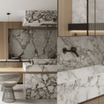
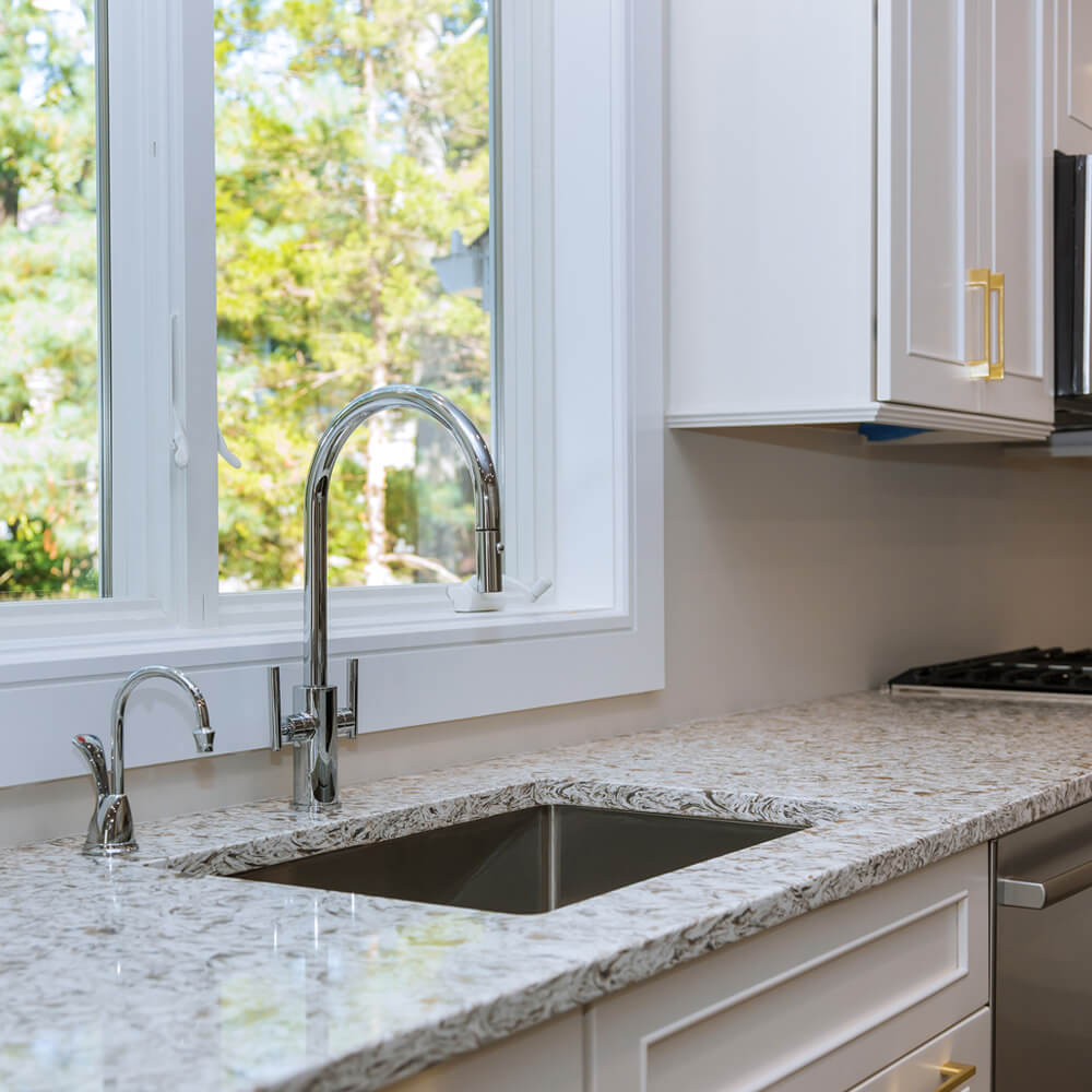
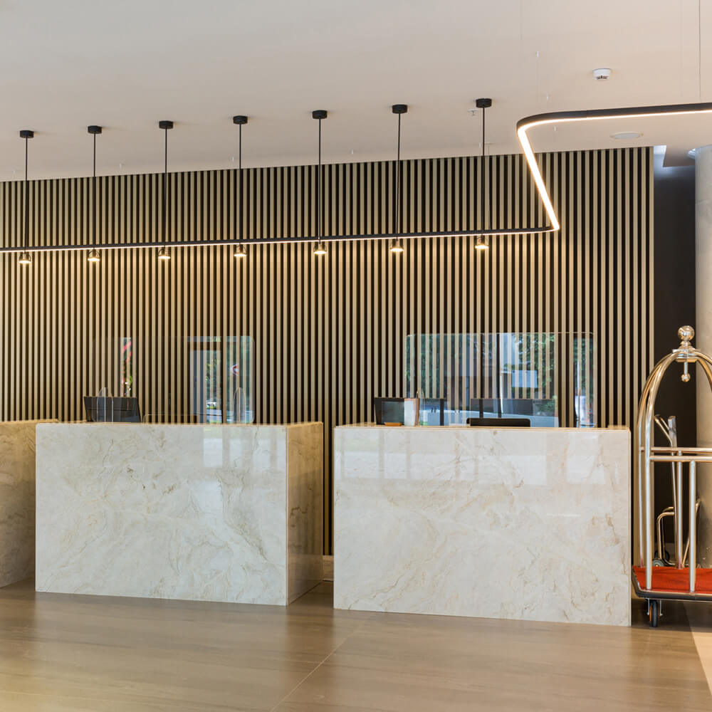
White Marble
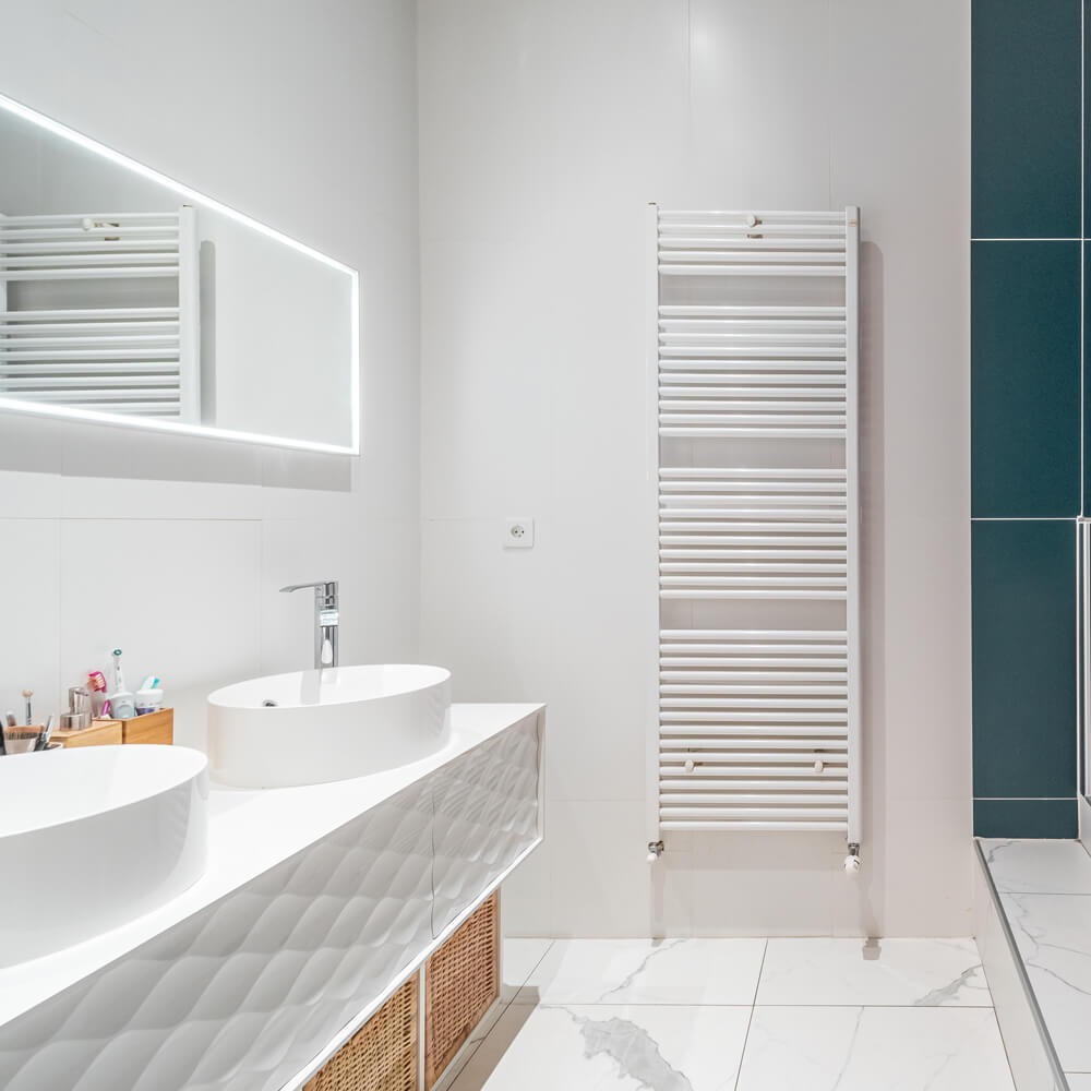
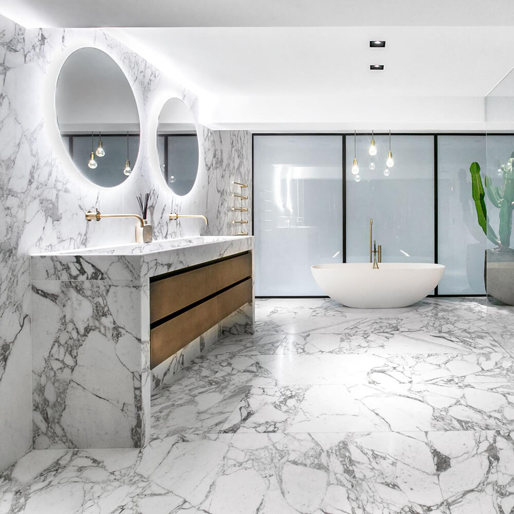
When a project calls for calm and brightness, White Marble is the natural answer. In compact kitchens, running the same slab from counter to backsplash erases shadow lines and creates seamless clarity. Narrow corridors benefit from a soft-matte finish that softens glare yet keeps the space feeling lifted. In spa-inspired bathrooms, white instantly signals cleanliness and relaxation, especially when paired with layered warm lighting. The smartest detail is practical: keep horizontal worktops matte, reinforce vulnerable cutouts, and include clear notes on neutral-pH care in the client handover.
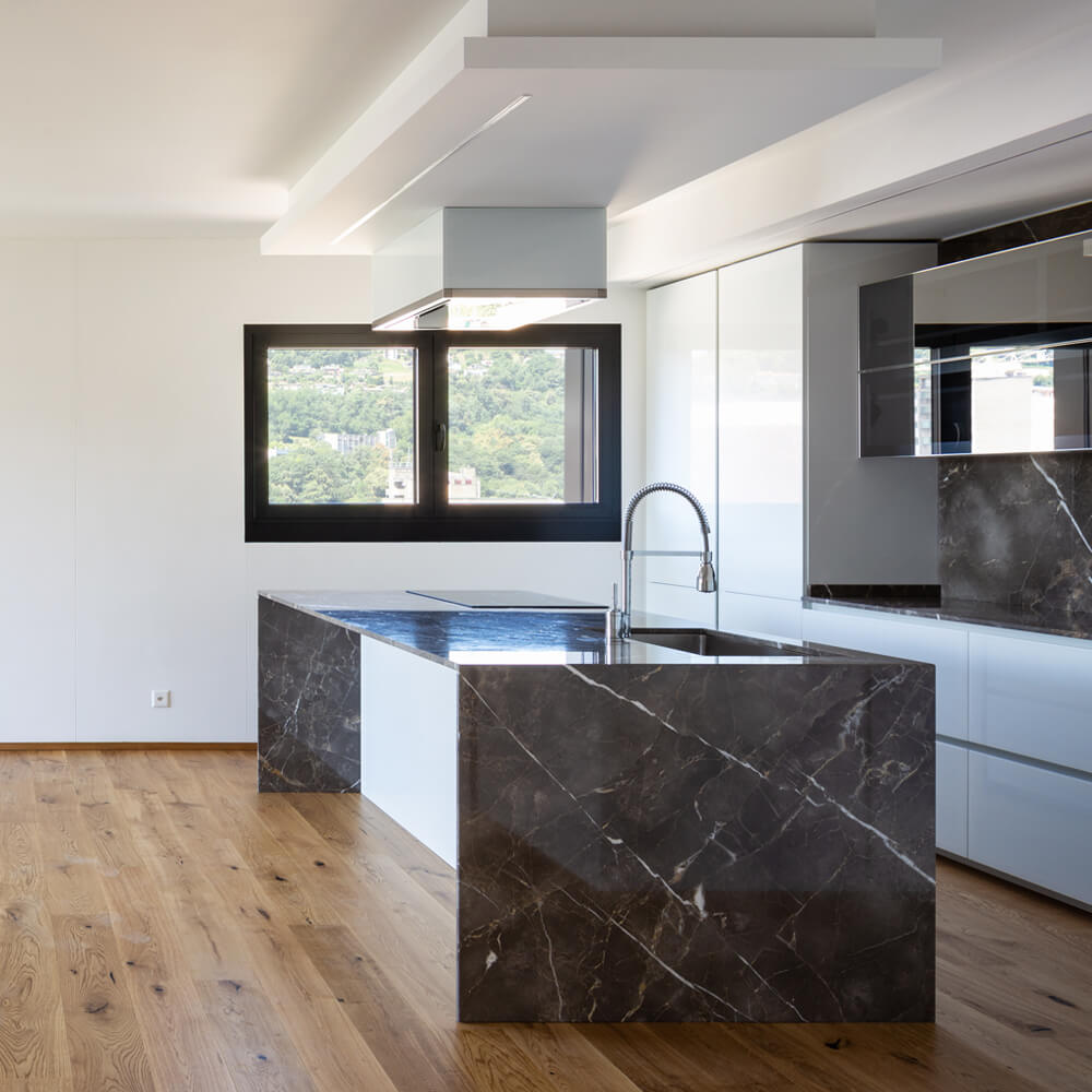
Black Marble
Choosing Black Marble is like slipping into a tailored tuxedo—it’s made for drama. On a feature wall behind a console, it turns simplicity into curation. In open-plan rooms, it acts as a visual anchor, adding focus and breaking up pale expanses. Powder rooms especially thrive with its moody backdrop, elevated further by warm-dimmable light. For daily use, specify a textured finish on horizontal splash zones to reduce visible spotting, while vertical polished panels become reflective design statements.
Finish, Scale, and Vein Movement
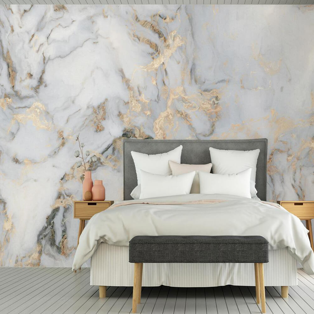
The finish sets the tactile tone and influences maintenance. Honed marble delivers softness, subtle grip, and muted reflections; polished marble amplifies light and feels formal, perfect for vertical applications or low-splash areas. Large-format slabs minimize joints, offering continuity, while modular tiles create pattern and rhythm economically. Vein orientation matters just as much: bookmatching yields dramatic, mirror-like symmetry ideal for feature installations, whereas slip-matching creates a gentler, flowing movement suited for countertops and corridors.
Room-by-Room Playbooks
Kitchen
A white direction enlarges the space and reflects task lighting, ideal when cabinets are mid to dark tones. Keep the working edge of the kitchen island in a soft texture and reserve more reflective surfaces for vertical splash areas. For a black direction, think contrast: light cabinetry with a dark monolith island or a framed splash panel. Integrate protective radii at corners and specify sealed edges around cutouts.
Primary Bath
White yields a spa register with instant cleanliness cues. Matte underfoot reduces glare and feels secure, while polished wall panels introduce gentle sparkle. A black direction creates boutique ambiance; pair it with dimmable warm light and a lighter vanity volume so fixtures do not disappear. Towel-dry splash zones and maintain a simple neutral-pH routine to keep either palette looking intentional.
Entry and Gallery
White keeps entries bright and welcoming, diminishing the need for excessive overheads. Black frames art and creates punctuation, especially in long sightlines. A mixed strategy—white field with dark inserts, or a dark plinth with light walls—often reads most architectural.
Expert Insights
Designers agree that lighting and finish should be signed off alongside the slab, not afterward. Fabricators emphasize that performance is quarry- and finish-dependent, not merely “white vs black,” which is why requesting current test data and a care sheet is part of due diligence. Maintenance professionals routinely point out that perceived cleanliness is mostly a function of reflectance and routine, not material color; microfiber habits and neutral-pH sprays keep both directions pristine without drama.
Case Snapshots
Compact Condo Kitchen
The space had limited daylight and tall dark cabinets. A white, matte worktop with a polished white splash lifted the room without glare. Under-cabinet warm-neutral strips avoided a blue cast. The result felt larger and calmer, with everyday cleanup handled by a neutral-pH spray and soft cloths.
Evening Lounge With Art
A dark wall slab sat behind open shelving and a low sofa. Lighting was layered and warm, with a low-reflectance finish that reduced fingerprint anxiety. Artwork popped, the room photographed beautifully after dusk, and routine wipedowns kept the surface immaculate.
Family Bath With Steam
Matte white floors provided grip perception and softness underfoot. A polished white vanity backsplash added reflection without increasing maintenance. Periodic sealing and simple habits kept the room bright and tranquil.

Buyer’s Checklist
Confirm accredited test data for density, absorption, flexural and compressive strength, and abrasion. Approve physical finish samples under project lighting, not showroom lighting. Document a maintenance plan that names neutral-pH cleaners, sealing cadence when recommended, and stain-avoidance practices in food prep and vanity zones. Align stone thickness, edge radii, and reinforcement at cutouts with the space’s traffic profile. Capture all of this in an O&M page the client actually receives.
FAQ
Is white or black harder to maintain in kitchens and baths?
Neither is intrinsically harder. Glossy dark planes reveal water and fingerprints faster in splash zones, while very bright polished surfaces can show etches under raking light. Finish and habit matter more than hue; matte textures and neutral-pH care keep both looking fresh.
Does matte always mean safer underfoot?
Matte often improves perceived traction and hides micro-scuffs. Real-world safety depends on texture, footwear, and site conditions, so treat finish choice as part of a wider slip-management plan.
Will black make my room feel smaller?
It adds depth and intimacy rather than simply “shrinking” a room. Use it to frame views, anchor furniture, and set a mood. Balance with lighter ceilings, soft lamps, and reflective accents so the effect reads intentional.
Can white feel cold?
Only if lighting runs too cool or flat. Layered warm-neutral lighting, natural wood, and textile textures transform white from “clinical” to calm.
Should I seal marble?
Most marbles benefit from a penetrating sealer on a sensible schedule. Sealing does not change day-to-day care: avoid acids and use neutral-pH cleaners.
References
Architectural Stone Council • ASTM Standards for Marble Dimension Stone Applications • ASC Technical Manual
Global Design Futures Forum • Marble in Minimalist and Maximalist Interiors 2025 • GDF Proceedings
Natural Stone Institute Research Team • Care and Maintenance Guidelines for Marble Surfaces • NSI White Paper
European Construction Standards Board • EN 12058 Compliance for Marble Slabs in Floors and Stairs • ECSB Guidance
International Surface Exhibition Committee • Emerging Trends in Bookmatched and Slip-Matched Marble • ISEC Report
Building Science Laboratory • Light Reflectance and Thermal Properties of White vs Black Marble • BSL Technical Notes
Urban Materials Think Tank • Sustainable Quarrying and Life-Cycle Impact of Natural Marble • UMTT Position Paper
Hospitality Design Consortium • Guest Experience and Material Choices: Marble vs Engineered Stone • HDC Brief
Stone Fabrication Council • Edge Reinforcement, Sink Cutouts, and Installation Best Practices • SFC Bulletin
Contemporary Interiors Research Group • The Role of Marble in Quiet Luxury and Monochrome Palettes • CIRG Review
While aesthetics drive the initial choice, long-term success depends on engineering and care. Dr. Helena Ruiz, Senior Researcher at the Natural Stone Institute, notes: “Color is only half the equation; finish, light, and maintenance transform marble from fragile to timeless.” Her colleague, architect Daniel Meyer, adds: “In design reviews, we no longer ask ‘white or black,’ but rather ‘what mood, under what light, with what care plan?’”The evidence is clear: White Marble expands space and conveys serenity, while Black Marble creates intimacy and dramatic contrast. Neither is universally “better”—they are tools for different narratives. By pairing stone choice with accredited test data, realistic maintenance schedules, and lighting strategies, designers can deliver interiors that feel intentional today and remain resilient tomorrow. In 2025 and beyond, the ideal marble is not defined by color alone, but by how thoughtfully it is specified, installed, and maintained.